
Design an omnichannel experience to increase customer satisfaction and drive growth.
Role : System Design | Ideation | Wireframe | Visual design | Overlook development
Duration : December 2017 - March 2018
Client : Baskin Robbins India
Team : Armaiti Irani (Project manager), Aayushi Bhotica

Baskin Robbins is one of the largest retail chains in India.
Project Brief
Baskin Robbins has close to 300 franchises across India. With a rise in on demand food delivery services, franchises were compelled to tie up with them which reduced their profitability.
Baskin Robbins was looking to launch their first ever e-commerce portal in India to help their franchises. This project was 2 dimensional. A system design to be able to receive and deliver orders from customers within a defined radius, along with an immersive web experience to attract customers to place orders on their website.
Research
With Baskin Robbins stores already attracting a wide range of audience, we were aware that understanding what made it so successful would be an important inquiry. A research team of 3 including me, spent time in 4 Baskin Robbins stores over a period of 3 days to gain insights.
What are the key points in the customers experience which create a sense of delight?
Are there any key patterns in the in-store behaviour of users which can be extended to their online experience?
How does a salesman interact with his customers?

Insights
Customers : 2 types
B. Explorers
A unique offering by Baskin Robbins is that they allow customers to try different flavours before making their decision. The staff ensures it introduces new flavours to each one.
A. Loyalists
Being in India over the last 25 years, a huge portion of customers are loyalists and know exactly what they want. They are quick to finalise their order and expect prompt service.
Salesman & Store
B. Insufficient Salesmen
No store had more than 2 salesmen cum delivery men leading to a high order rejection rate.
A. Bad internet connection
A few stores had terrible to no internet connection, however they all had a landline connection.
C. Onboarding salesmen onto a new platform
Most were used to current systems by on demand food delivery services such as Zomato and Swiggy. Onboarding a large number of salesmen across the country onto a new platform would be a key challenge.
D. Salesmen are preoccupied with customers
The computers in stores aren’t connected to speakers. Drawing the salesman’s attention to an incoming order without a sound trigger is something the system would have to be designed around.

Problem Statement
How might we design an omnichannel experience for
Baskin Robbins customers & salesmen which enables
swift on-boarding.
Experience Goals
A. Quick and easy Onboarding of stores
Use of common and familiar interactions for salesmen to be able to swiftly incorporate the new system.
C. Allow customisations to create loyalty
Today no users can add toppings to their ice cream online. Catering to this demand will help build loyalty.
B. Create Delight
Incorporate an exploratory journey in the purchase experience which will introduce them to new flavours.
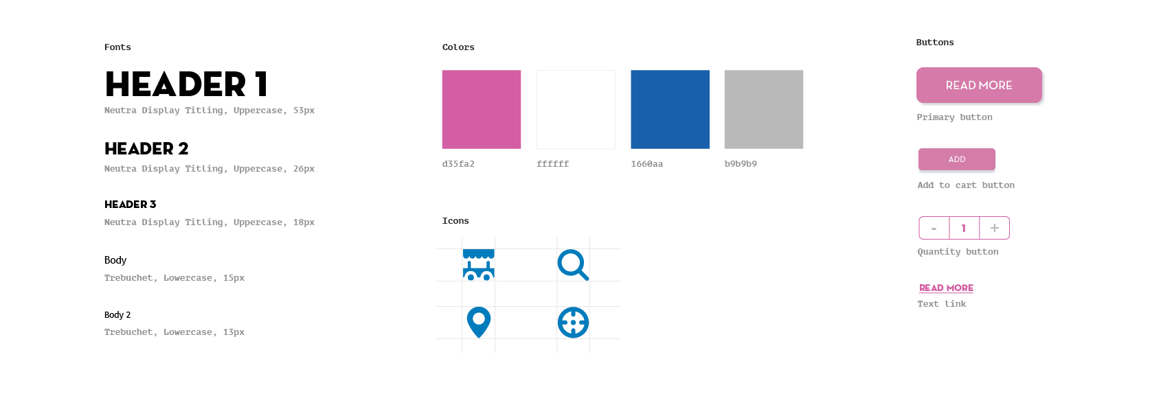
Styleguide
Navigation Design

A Card Sorting exercise was carried out
to help us organise and design an intuitive navigation. Old navigation(Left), New navigation(Right).
Navigation Comparison
Important Features
Surprise Me!
A feature that works on an algorithm that tracks your previous purchases, browsing history along with product popularity to introduce new products and flavours to users. This serves as a marketing tool for the business along with giving the user an opportunity to be introduced to new flavours like he would in the store.
Tone of voice : Casual, Funny, Friendly, Engaging
IVR Call integration
Learning that salesmen aren’t always able to look at the computer screen, an order can be accepted via an IVR call. We experimented with different time intervals to define it’s frequency and number. This was based on how long users were willing to wait before they receive an acceptance for their order.

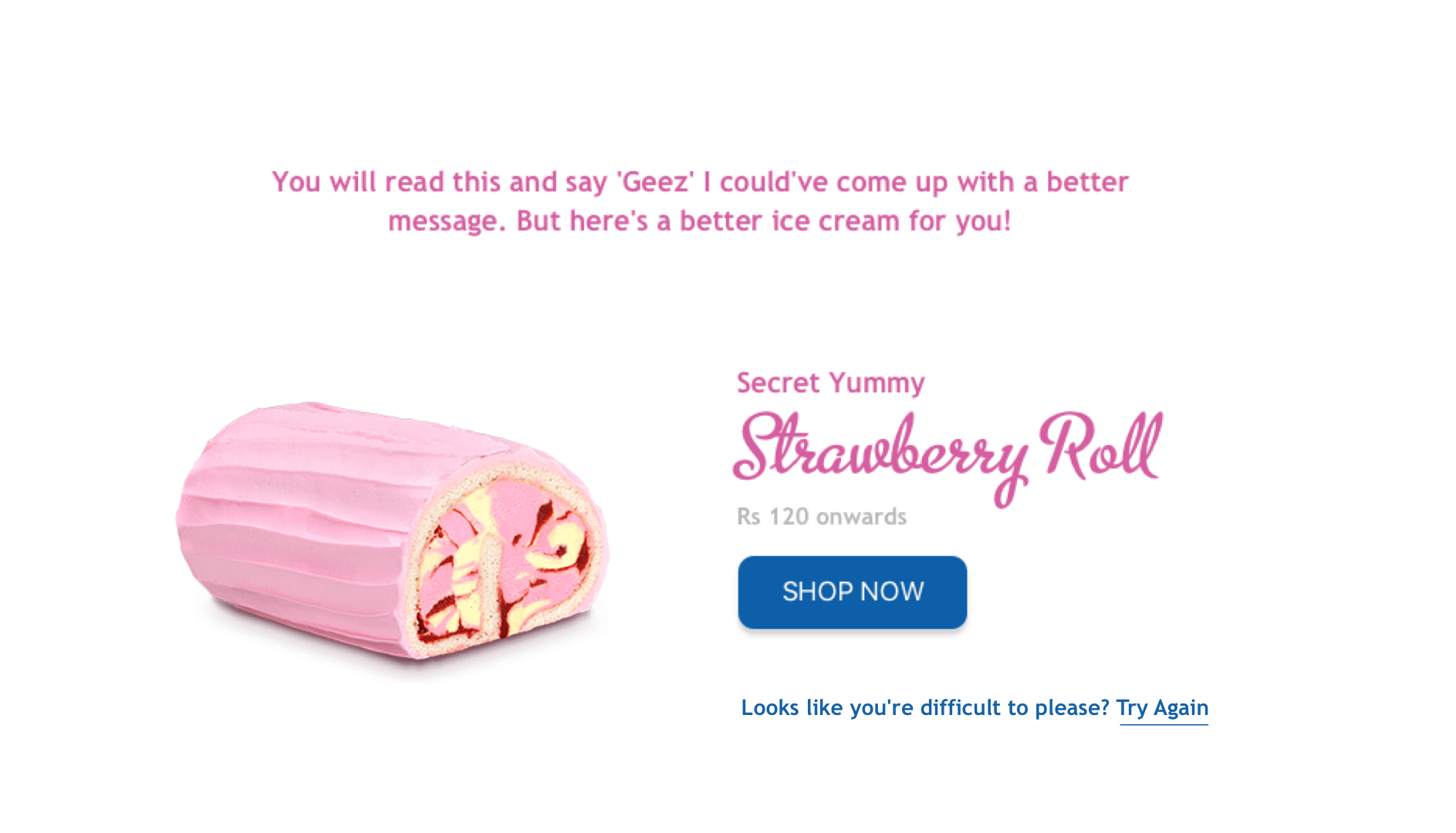
Customize your ice cream
Add toppings or request the ice cream in a cone. Any additional costs will be immediately reflected in the total product cost as you make your selections.

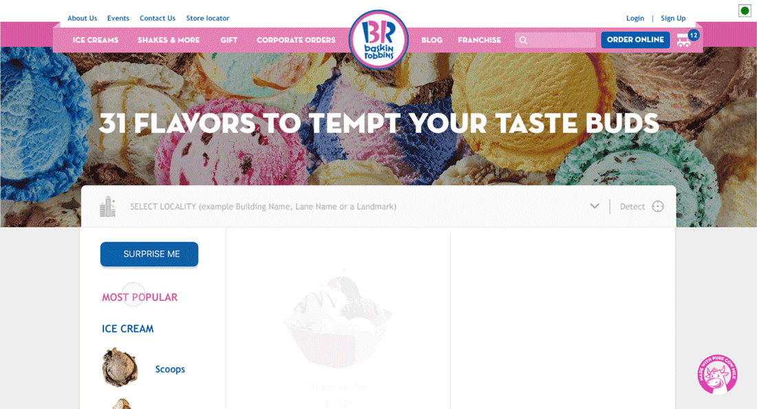
Quick browsing of products
Left hand side navigation allows users to browse the different product categories and sub categories with ease. Users can also browse the price of different product sizes upfront before deciding to move forward.

“I had the pleasure of working with Aayushi on the brand new ecommerce website we built for Baskin Robbins. I found Aayushi extremely sharp and perceptive to client’s business needs. She was was quick to grasp the channel nuances and ensured that business requirements were met. Aayushi was instrumental is delivering an aesthetically good looking website with all functionalities which can rival any of the food delivery players in the market. I enthusiastically recommend Aayushi and wish her all the best in all her future endeavours.”

Key revisions post user testing
Product Page
Initially the quantity selection was step 3. The decision was based on 2 thoughts; First, how users order in-store. They start with the product of their choice, how many would they like and if any customisations were required. Second, after analysing multiple other e-commerce websites.
However I think what wasn’t taken into consideration was that the customisations made to the product would apply to both units on the website. This caused users to raise questions like “What if I want sprinkles on one & chocolate sauce on the other, can I do that in a single flow?”. There was always a moment of doubt and uncertainty. After a lot of experimentation we decided to push the quantity to the last step. This allowed the customers to have an improved clarity of the process.

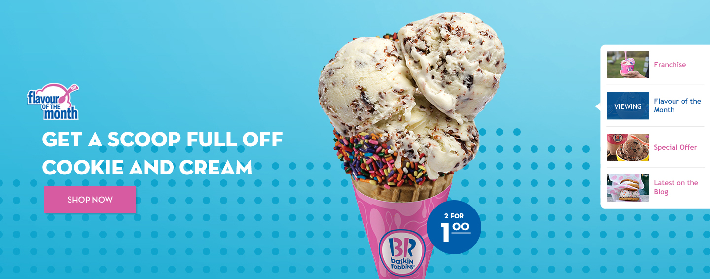
Homepage banner
Moving into this, as a team we were aware that offers would be the primary motivation for users to use the official brand website to order v/s on demand food ordering apps. The banner on the homepage was going to be a critical real estate to drive this. However the banner failed to do so inspite of us running 3-4 offers on most occasions. Post analysing heat maps (Hotjar), we noticed that most users didn’t spend time on the banner area and quickly scrolled through or moved on to another page. The problem could be two fold, the banner visual design didn’t drive the point across well & more importantly the user had no idea what he was missing out on! We revised the design to change the banner navigation to spell out the offerings more directly by adding a banner navigation on the right to call out banner headers.
Impact


Fin.
I found that the approach towards a system design v/s a website design as an exercise was extremely different. There were a lot of small nuances that needed to be taken care of and role playing amongst team members helped put ourselves in the shoes of our users. What I found interesting is to be part of how a new product is rolled out to an audience. We first chose to test it out with one city and 15 franchises, which helped us clean up most of the bugs in the system. Post that we slowly started rolling it out to more number of cities over a planned course of 6 months. During this time, we made significant improvements on a daily basis via analysing heatmaps, user journey videos and google analytics.
I went on to explore designing and coding a chatbot for Baskin Robbins. This chatbot would help suggest ice creams to users based on their mood. Users could describe their likes and dislikes with respect to flavours as well. This was a personal project and not part of the client project.
